The power of patterns and playbooks in content design
Build out your content design system to reduce stress and create consistently effective content across the end-to-end experience.
Most content leaders agree that a style guide and terminology list belong in a design system — and that design system components must include content or sample content according to the correct content guidelines. This is a start, but I believe every content team should also work toward building out their own set of content components and patterns. Extensive patterns build consistency while reducing stress and allowing content designers to focus on larger design issues.
Writing is subjective and stakeholders are many. Often stakeholders don't agree on the best approach or even the desired outcome of a content experience. Recently, I found myself feeling the need to provide air cover for a content designer in a stakeholder review with an executive who had plenty of opinions and little context. Another content designer spent six months reacting to constantly shifting directions as the company went through some pretty severe leadership churn.
How, as an organizational leader of content designers, can I equip my team with the arguments, tools, and evidence they need to respond to contradictory and shifting demands?
I can help them develop the right questions ("It sounds like you're suggesting a solution to a problem. Could you tell me the issue you're trying to solve for instead?"). We can create artifacts for reference, such as an extra box in the Figma that explains the content strategy behind a specific flow. And, we can work closely with our UX research partners to demonstrate the effectiveness of our choices. But I think these tactics don't take advantage of the benefits gained from further creating a system for making content decisions.
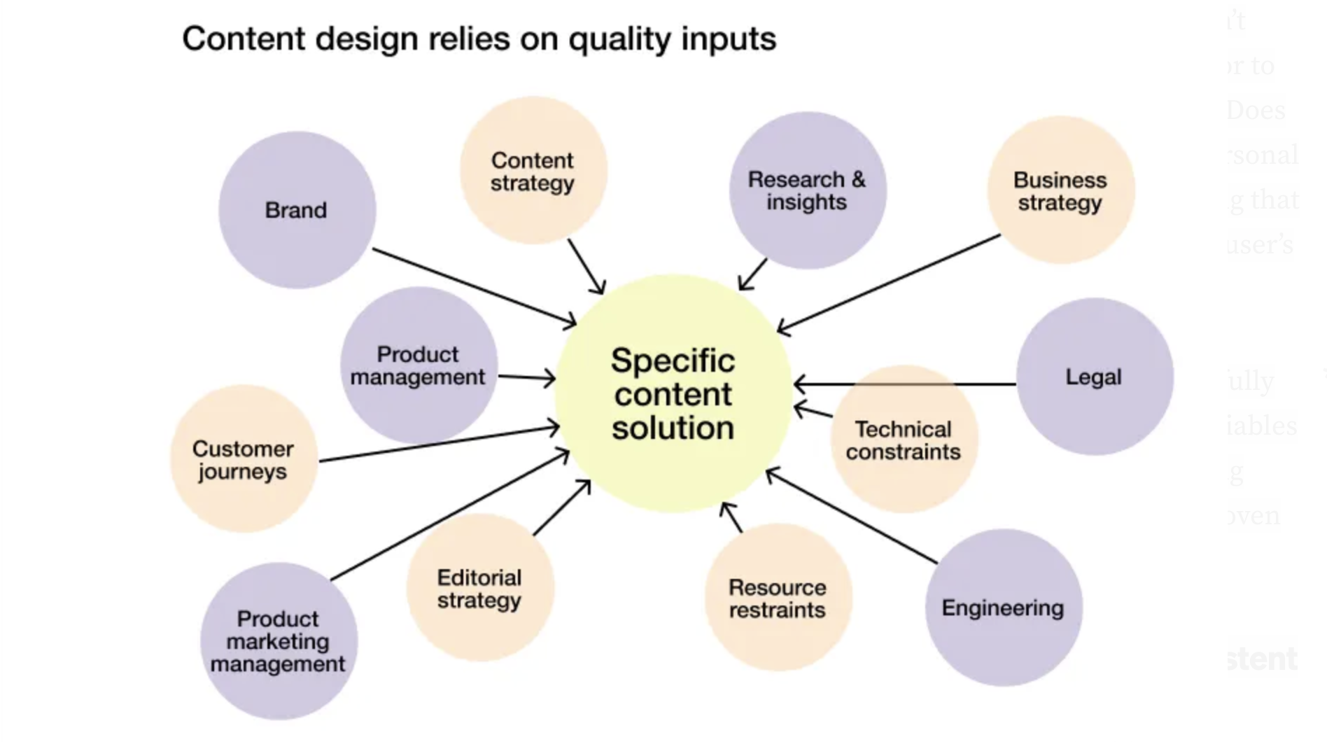
The inputs determine the outputs
My PhD is in Rhetoric, and my understanding of the position content designers are in can be framed using Aristotle's framing of the rhetorical situation. The author and text sit at the center and work with three inputs — the audience, the purpose, and the context. Without these inputs, the rhetor cannot be successful.
In product design, the content designer's goal is to create the best solution for the situation — to deliver the right content to the right people at the right time.
We must know our audience, our users, based on information from our UX research teams and other cross-functional teams. We need to know their interests, their motivations, the reasons they choose our products, why they decide to stay or leave, when they engage, and how much they know and want to know about how our products work or give them value.
Purpose already becomes more difficult, as it shifts throughout the user's journey. Writing for a prospective customer is not the same as writing for one who is in a trial or one who has already purchased. Writing to drive conversion is not the same as writing to drive adoption or engagement.
Context and purpose are sometimes intertwined as we consider the user's journey using a service design perspective. Where are our users when they're on our mobile app vs. our desktop app? The information that interests them is different when they are at home on their computer than when they are out at a café using public Wi-Fi or only connected to the internet via their phone. The same applies to tasks they are willing to do in various situations.
Content designers are experts in assimilating all of these inputs into a content solution. In fact, the more information they have as inputs, the better the output. I use the following diagram to help my cross-functional partners understand that in order for a content designer to produce the best content, the detail and quality of inputs like these is crucial.
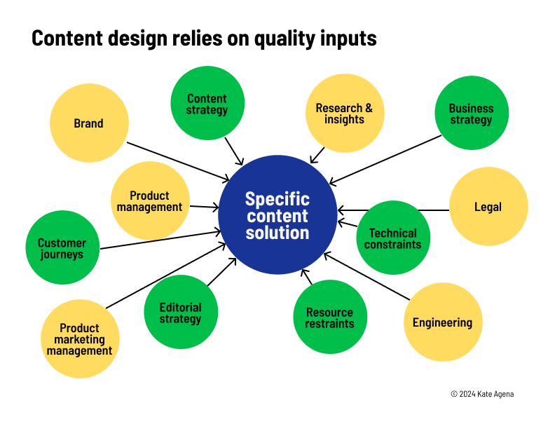
If the goals of the experience are not clear, the content designer doesn't know, for example, if they are writing to solve a problem of adoption or to get an already motivated user set up as quickly and easily as possible. Does the user already trust our brand and product enough to enter their personal information or do we need to write to build that trust by demonstrating that we are trustworthy? And what data do we have about this point in the user's journey?
Given the degree of complexity involved in content design work, carefully developed patterns provide boundaries and reduce the number of variables a content designer must manage. Instead of making all of these writing choices for every situation ad hoc, the pattern steps in to provide a proven framework as a starting point.
Structured writing reduces stress and leads to more consistent content
My initial work in content was writing end user documentation in the structured format of DITA XML. DITA stands for Darwin Information Typing Architecture. Templates for concept, task, and reference topics each include a structured series of modular sections for content. The resulting consistency reduces the cognitive load for both writers and readers.
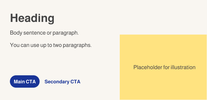
Even if you're working in Figma, you can create your own architecture of templates for the different types of content elements you produce. For example, our product uses action center (AC) cards as the main driver of user engagement from the dashboard. These AC cards flex in purpose, covering various goals that arise from the business or from the user — everything from driving feature adoption or engagement to cross-sell/upsell.
Each AC card has three main text elements: a heading, a body sentence/paragraph, and one or two calls-to-action (CTAs).
Without established patterns, content designers have a lot of options open to them. And they often have stakeholders asking for different approaches. To land on a pattern, we have to consider all of the inputs mentioned above. Where in the user's journey is this specific AC card appearing? What is the main goal?
And what strategy are we using for the content? Obviously, we have our voice to consider. But beyond that, we often get conflicting pressures to reduce the amount of words to the bare minimum, to make the content more friendly and guiding, or to make all of the content benefit-led with a punchy, marketing feel. Especially if the work impacts something as widely used as a product's main dashboard, you might easily have input from 20 or more Product Managers (PMs).
Mapping voice and tone based on user context
To begin to map how our voice and tone flex based on user context, I developed both a message architecture (á la Margot Bloomstein) to guide communication priorities and a set of quadrants to demonstrate how tone might change based on the situation. I borrowed this initial quadrant framework from Matthew Rayback of Adobe who shared it in his presentation at the 2023 Confab conference.
The message architecture establishes a hierarchy of communication goals and helps content designers adapt our brand verbal guidelines for use in product.
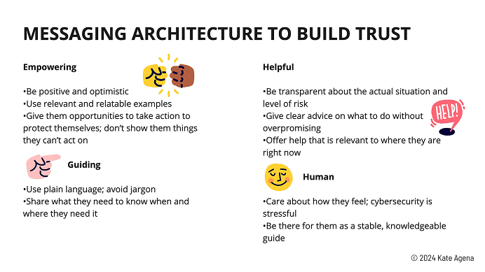
From there, I took the qualities I identified for the message architecture and provided descriptions specific to each quadrant. I included examples of content that belong in each quadrant.
This is a step toward providing writers with actionable, repeatable directives they can use while developing content. The next step, however, is where we take this foundation and build out content patterns that are backed by research and agreed upon by all important stakeholder groups.
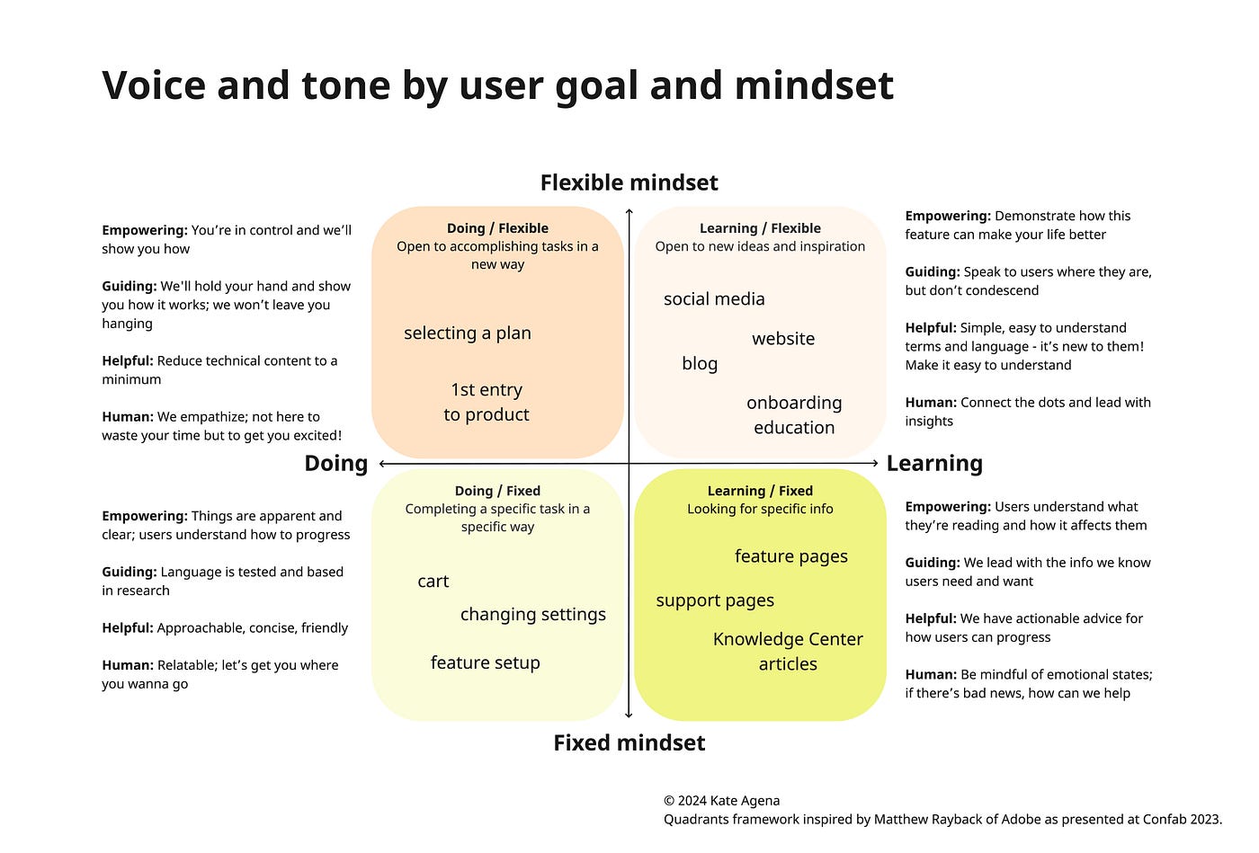
Building patterns that can flex across the user's journey
Now that our quadrant diagram gives a notion of how voice and tone flex depending on the audience's context, we can start to build out patterns for UI elements.
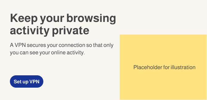
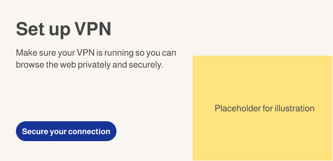
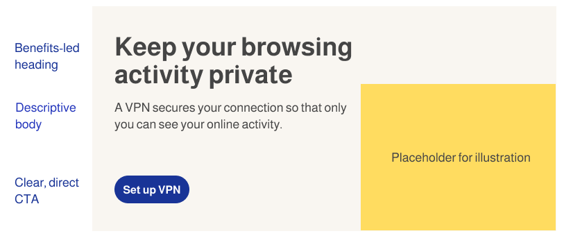
Using our example of AC cards and their three elements, we can initially consider various strategy options for each element and combination of elements. Let's imagine the AC card's goal is to encourage a user who has not yet turned on the VPN feature to turn it on.
The heading can focus very directly on the task: Set up VPN
Or it can be benefit-led with more marketing-focused writing: Keep your browsing activity private
Or it can act as a friendly guide: Let's secure your Wi-Fi connection
The body sentence can provide a clear description of the feature: A VPN secures your connection so that only you can see your online activity.
Or it can provide more details on the benefits or value prop: Make sure your VPN is running so you can browse the web privately and securely.
Or it can provide more guidance: Use VPN whenever you are using a public Wi-Fi to keep your browsing activity private.
The same goes for the CTA. It can state what happens when you click: Set up VPN
Or be a call-to-value (CTV): Secure your connection
Finally, you could try a CTA that offers to be there with you as a guide: Get started
Now, we've developed an example of each of the strategies that have been suggested for each element. The next step is to combine them to get the most out of the AC card — if we only have three elements to work with, we don't want any content to be redundant.
If the heading is benefit-led, the body could be a more clear description, and then the CTA could go either way.
If the heading is direct, the body could focus on the value prop, and again the CTA could go either way.

Another option is to focus on guiding the user in each section.
A mixture of strategies is likely the best solution. If all of the content elements focus on the benefit, the user won't even know what feature they're about to set up. If all of the content focuses on clarity, you might have the best results for ease-of use and low cognitive load, but your users might not have the motivation to set up the feature. Hopefully, your UX research and data science teams can give you some insights to weigh these options.
Once you have a set of variations, the testing can begin. Your UX research partners can do quantitative or qualitative studies to determine how well each option meets the objectives of the specific AC card or you can run AB tests and get the telemetric data. As part of the research plan, your stakeholders should agree on the desired outcomes, whether that be something like motivation to set up the feature or level of understanding the task they are doing and why.
You can do this for a group of AC cards that have the same purpose. For example. AC cards that drive adoption vs. AC cards that drive engagement vs. AC cards for cross-sell or upsell.
Eventually, you have enough data to agree on a pattern for each type of AC. card.
You can document this pattern alongside the content guidelines in the design system documentation or you can create a playbook specific to that type of content with additional information to help determine which pattern to use when.
Benefits of content patterns and playbooks
By developing content patterns not just for content types like AC cards, but that flex across different contexts and purposes, you can provide content designers with a firm foundation to begin their work. These patterns make it easier to build out terminology and consistent value-props for each feature. If you're using content components, snippets, or some other system for content reuse, you now have a system to organize and classify that language.
Though I hesitate to mention it for fear of promoting the idea that AI is capable of doing sophisticated content design work, having structured patterns also allows for GenAI solutions like Writer to more effectively create drafts for new content. Customized templates — along with a knowledge graph, style guide input, and exemplary content to train the LLM — make generation of a variety of working first drafts very efficient. From there, a content designer can carefully craft a final version.
Having these documented patterns already supported by research and agreed upon by a larger set of stakeholders allows content design to support their choices when facing feedback or explaining their work to new stakeholders or leadership. The patterns allow content designers a starting point with less moving pieces to consider as they analyze all of the inputs for the specific content solution. They can put their time into making sure the new solution fits well into the larger product set or into becoming experts in the subject matter.
The final result is less stress and burnout for content designers who are now able to focus their attention and efforts on what is still very complicated work. The final result for the product is more consistently effective content. And the final result for the user is a more coherent experience.
References and acknowledgments
Margot Bloomstein, Content Strategy at Work: Real-World Stories to Strengthen Every Interactive Project, Morgan Kaufmann/Elsevier, 2012.
Matthew Rayback, "Less talk: Designing beyond voice and tone," Confab conference, 2023.
Special thanks to my team at McAfee for all of your contributions to this work — I learn with you every day.